TL;DR
Landing page templates are worth using for their structure, not their looks. Pick the section order by traffic temperature and offer: a direct-offer page for hot traffic, an advertorial or listicle for cold, a lead capture or demo page for sales-led offers. The best template is a page already converting, yours or a live one in your niche, rebuilt with your brand and matched to your ad.
The best landing page templates aren’t in a gallery. They’re pages already converting paid traffic, rebuilt with your brand and matched to the ad that sends the click.
A gallery template is a guess about who’s arriving, made before your ad existed. Fine for a first page. A bad system for a paid account.
Galleries sort by industry. Your structure should come from how warm the visitor is and what the ad promised. Below are eight section-order blueprints built that way, plus a rule for when to stop starting from templates.
Key Takeaways
- Sort templates by traffic temperature and offer, not industry. A cold TikTok viewer and a cart abandoner need different section orders for the same product.
- Length follows awareness and price. Conversion Rate Experts’ Crazy Egg page ran about 20 times the control’s length and beat it by 30%, because the extra length answered objections.
- A “high-converting” label means little alone. Unbounce’s 2024 benchmark puts the median landing page at 6.6%, with industry medians from 3.8% to 12.3%.
- Anything is a template. Your best one is the page already converting behind your best ad, or a live page in your niche rebuilt with your brand.
What landing page templates give you (and what they can’t)
Structure, not strategy
A landing page template, from a builder gallery, a design marketplace, or a website theme, hands you a section order, a layout, and placeholder copy. That saves time. It can’t tell you why each section sits where it does, because it has never seen your traffic or your ad.
So a “high-converting landing page template” label tells you little. Unbounce’s 2024 Conversion Benchmark Report put the median landing page conversion rate at 6.6% across 41,000+ pages, with industry medians ranging from 3.8% to 12.3%. The same layout lands at either end depending on the offer and who clicked.
Three decisions a template makes without asking
- The headline slot, sized for a generic promise, not your ad’s hook.
- The section order, whatever the designer assumed: benefits, then proof, pricing near the end.
- The length, short for a clean screenshot or long to look thorough, never set by your visitor’s awareness.
Those three choices matter more than the color palette. It’s why Pagedeck starts from the ad instead of a gallery: point it at the ad and it picks up the offer, the angle, and the creative, then builds a landing page for every ad you run.
Pick landing page templates by traffic temperature, not industry
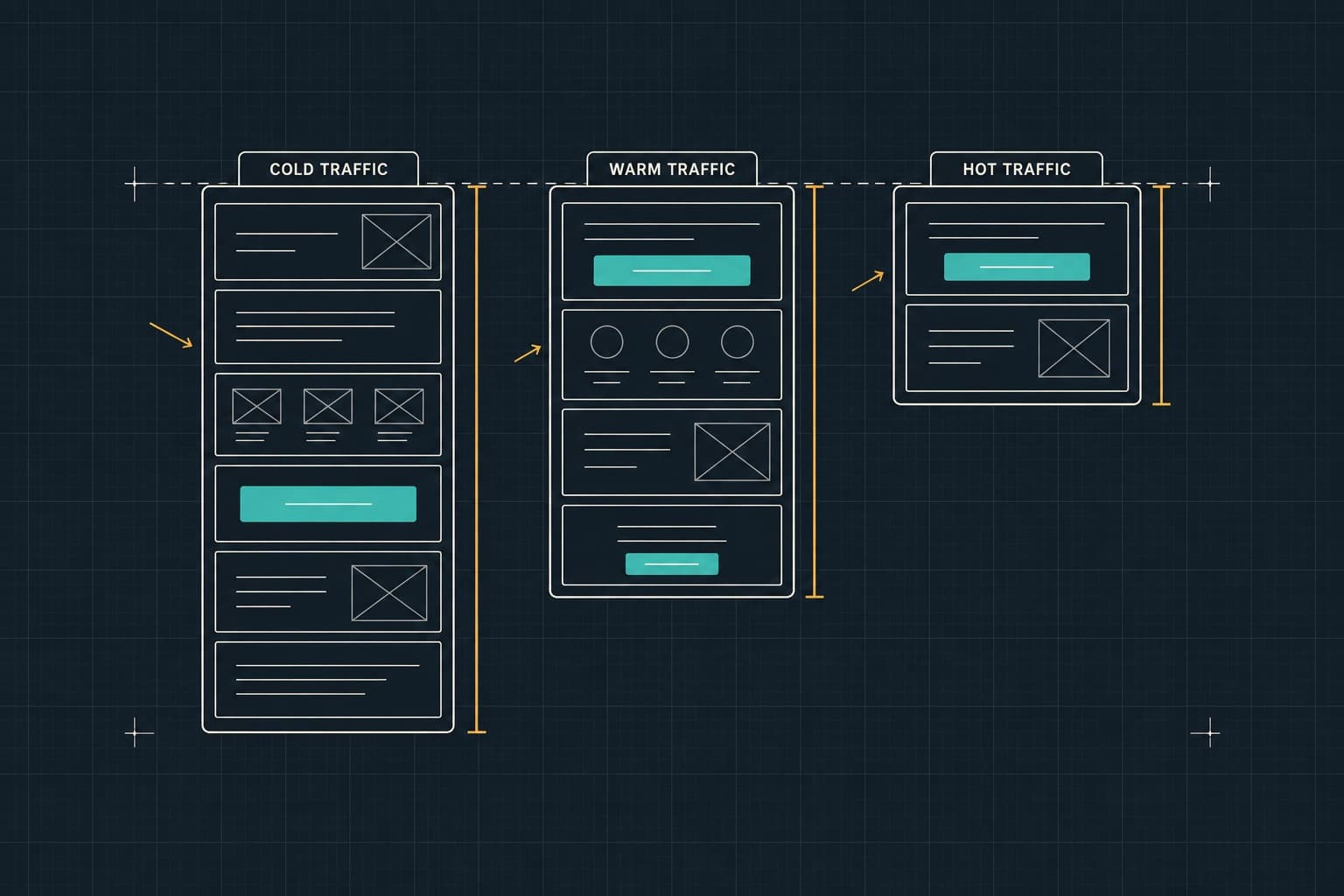
Traffic temperature is how much the visitor already knows when they land. It sets the page’s job, its length, and where the first CTA goes.
| Temperature | What the visitor knows | The page’s job | Length | First CTA |
|---|---|---|---|---|
| Cold: prospecting on Meta, TikTok, YouTube | The problem, maybe. Not you. | Earn the decision | Long, 5 to 10 screens | After the mechanism, about a third down |
| Warm: retargeted video viewers and site visitors, comparison search | The category and a few options | Answer the comparison | Medium, 3 to 5 screens | Hero, repeated after proof |
| Hot: cart retargeting, branded search, email | You and the product | Close | Short, 1 to 3 screens | Hero, above the fold |
Cold traffic: the page earns the decision
A cold visitor didn’t plan to buy today. The page names the problem, explains why the usual fixes fall short, and introduces the product as the answer before asking for money. Price in the first screen asks for a decision they haven’t made.
Warm traffic: the page answers the comparison
A warm visitor is weighing options. Give them the reason to pick you: a comparison, a specific proof point, a guarantee.
Hot traffic: the page closes
A hot visitor already chose. Show the offer, reassure, and get out of the way. Every extra section reopens a decision they’d already made.
The model underneath is Eugene Schwartz’s five stages of awareness from Breakthrough Advertising (1966): unaware, problem aware, solution aware, product aware, and most aware. The less aware the visitor, the more the page says before the offer.
Take a hypothetical skincare brand whose media buyer, call her Dana, runs cold TikTok ads on a “why your moisturizer stops working” hook. The traffic lands on a gallery template: product shot, price, Add to Cart.
Visitors hit the price before they know why they’d want the product. She rebuilds it as an advertorial that opens on the ad’s hook and brings the product in a third of the way down. Same product, same price, same creative, duplicated with the new destination URL. In this illustrative case, cost per purchase drops from $62 to $41.
8 landing page structure blueprints
These eight types of landing pages cover cold, warm, and hot traffic across ecommerce, software, services, and events. Each is a section order, top to bottom, with the reason for each position.
1. Direct offer (hot traffic)
For retargeting, branded search, and email: a running shoe brand’s cart abandoners, a software trial user who viewed pricing.
- Hero with the offer: product, deal, price, CTA. They came to act.
- Proof strip: rating, review count, or logos. Reassurance, not persuasion.
- Offer detail: what’s included and the buy box or plan picker, where the decision happens.
- Objection answers: shipping, returns, contract terms.
- Risk reversal and repeat CTA, guarantee beside the button.
Mobile cut: fold the objection answers into tap-to-open rows. Common mistake: adding a benefits section that re-sells a product the visitor already chose.
2. Advertorial pre-sell (cold traffic, considered purchase)
For anything the visitor has to be talked into: skincare, sleep, a home service, a financial product.
- Editorial headline continuing the ad’s hook. No price.
- The problem as a story, so the reader self-identifies before any pitch.
- The mechanism: why the usual fixes fail, which makes a new one worth hearing.
- Product introduction, a third to halfway down, once the reader wants a fix.
- Proof: reviews, expert quotes, results where ad policy allows.
- Offer and CTA into a buy box or product page.
Mobile cut: shorten the story, never the mechanism. Common mistake: the product in the headline, which turns the page back into an ad. The full format is in our guide to advertorial landing pages.
3. Listicle (cold to lukewarm, category education)
When the visitor needs the category before the product: “5 reasons teams are dropping spreadsheets for scheduling.”
- Numbered headline continuing the ad’s hook.
- The first item or two, product-neutral, to earn agreement.
- The product enters at item two or three, once agreement exists.
- Later items: claim, mechanism, visual, and proof inside the item.
- Summary and offer, while the case is fresh.
Mobile cut: one screen per item. Common mistake: feature lists dressed as items. More on listicle landing pages.
4. Bundle or tiered offer (warm traffic, AOV-led ecommerce)
When the campaign sells quantity: buy two get one free, a three-pack, a starter kit.
- Hero framed as the deal, because the offer is the ad’s angle.
- Tier selector right below it, middle tier preselected, since the default anchors the choice.
- Per-unit math for each tier, so the shopper doesn’t do it.
- Proof tied to repeat use: why anyone wants more than one.
- Objections: subscription terms, returns on multi-packs.
- Repeat selector and CTA.
In Pagedeck, tiered discounts, bundles, and BOGOs are built into the page and wired to live Shopify product data. Mobile cut: stack the tier cards. Common mistake: a SaaS pricing table comparing features when the shopper is choosing quantity.
5. Lead capture (content, quote, or consultation offer)
For offers that trade value for contact details: a free quote, a benchmark report, a case review.
- Hero naming the offer, form or its button above the fold.
- Proof beside the form: reviews, licensing, client logos.
- What happens next, in three steps, because uncertainty stalls the submit.
- Offer details: what the report or quote covers.
- Objections: price range, service area, response time.
- Repeat form or CTA.
The form is an embed from your CRM or email platform. Pagedeck doesn’t ship a native form, but it can count the submit as the page’s conversion. Mobile cut: move offer details below the form, and add a click-to-call button for services. More in our guide to lead gen landing pages.
Consider a hypothetical HVAC company whose marketing manager, call him Marco, runs Google search ads on “AC repair near me.” His page is a free SaaS template: feature cards, a pricing table, a form at the bottom.
Searchers don’t want plans. They want to know if someone can come today and what it costs. Marco moves the quote form and a call button into the hero and swaps the pricing table for a price range. In this illustrative case, submits and calls per 100 clicks go from 4 to 9.
6. Demo or free trial (software, B2B)
For software sold through a trial or a demo call: payroll, analytics, security.
- Hero: outcome headline, product screenshot, one CTA.
- Customer logo bar, answering “do companies like us use this?”
- How it works in three steps, before any feature list.
- Two or three feature blocks tied to the ad’s angle.
- Proof: a case study number, a testimonial with a job title.
- FAQ: security, integrations, migration, pricing.
- Closing CTA.
Mobile cut: one feature per screenshot. Common mistake: keeping the main site’s navigation, which gives a paid visitor six exits.
7. Click-through pre-cart (warm traffic, higher price)
When the price needs justifying first: a $1,400 mattress, a $3,000 coaching program.
- Hero: product, core promise, “see options” CTA.
- Why it’s worth the price, in three benefits.
- Comparison against the alternative they’re weighing, the real competitor for the sale.
- Proof: reviews, press, the guarantee.
- Price framing: cost per use or financing, right before the ask.
- CTA into the cart or booking page, choice preselected.
Mobile cut: trim the comparison to three rows. Common mistake: handing off to a generic product page that restarts the pitch.
8. Event or webinar registration
For webinars and events: an accounting firm’s year-end tax webinar, a software launch.
- Hero: title, date, time zone, register button. Attendance is a calendar decision.
- What you’ll learn, in three lines.
- Speakers, one credential each: the reason to show up.
- Who it’s for, and who it isn’t, which protects show rate.
- Proof: past attendee quotes.
- Repeat registration and the replay promise.
Mobile cut: one-line bios. Common mistake: the date buried below the fold.
The anatomy of a landing page: sections every blueprint shares
The eight blueprints reorder the same landing page sections. Why each one converts is in the high-converting landing page guide. The short version:
The hero: four jobs in one screen
The hero says what it is, who it’s for, why to believe it, and what to do next. NN/g’s scrolling and attention study found 57% of viewing time goes above the fold and 74% to the first two screenfuls.
Proof placed at the point of doubt
Proof goes right after the claim it supports. A review about fit sits beside the size picker, a security badge beside the demo form.
Objections answered in-line
A bottom FAQ reaches the few who scroll that far. Answer objections where they arise: shipping next to the price, contract length next to the plan.
The closing CTA and the risk reversal line
The last CTA repeats the offer next to the guarantee or the “no credit card needed” line. Unbounce’s benchmark found 83% of landing page visits came from mobile, so plan the phone stack first. Our guide to landing page design covers the layout.
How long a landing page should be
Length follows awareness and price, not taste. The less the visitor knows and the more the product costs, the more objections the page must answer.
Conversion Rate Experts’ Crazy Egg case study is the classic example: the redesigned page ran about 20 times the control’s length and beat it by 30%. The extra length answered real questions: how heatmaps work, the price, how the tool compared with alternatives. It’s one example, not a rule, but it shows what extra length is for: answering objections the visitor already has.
Signs the page is too short
Visitors reach the bottom and leave without clicking. Sales hears the same pre-purchase questions every week.
Signs the page is too long
Scroll depth drops before the first CTA. Sections repeat what the hero already said.
Anything can be your landing page template
Pagedeck doesn’t have a template gallery. It doesn’t need one, because anything is a template: a live page you admire, a mockup from your designer, a layout you sketched.
The template was designed before your ad existed
A gallery template was set up for nobody in particular. Your ad made a specific promise to a specific person, so start the page at that promise.
One template, twelve ads
A new angle ships and points at the existing page, which matches one ad and half-matches two more. Our landing page examples that convert paid traffic break down that failure.
Picture a hypothetical payroll software company whose demand gen manager, call her Priya, runs three LinkedIn angles: compliance risk, hours saved, and moving off spreadsheets. All three point at one demo page headlined “modern payroll for growing teams,” which matches none of them.
She duplicates the page twice, keeps the section order, and rewrites the hero, proof, and FAQ per angle. In this illustrative case, demo requests per 1,000 clicks rise on two pages. The third tells her the spreadsheet angle needs a different offer, not a different page.
Your best template is the page already converting behind your best ad
Once a page works, it becomes the template. Connor Rolain, Head of Growth at HexClad, put it plainly: “Once you find a format that works, you can easily duplicate it and swap out copy/media to make it congruent with your ad creative.”
Fulton made its existing pages the base for new tests: 100% of paid traffic on Pagedeck pages and 50+ iterations on a single core page. Here’s how Fulton increased paid conversion rate by 110%.
Recreate what’s live in your niche, a mockup, or a sketch
No winner yet? Borrow a proven structure. Pagedeck’s research agent searches 1M+ live landing pages in your niche by niche, offer, brand, or tactic, and shows which get the ad spend. It covers any company running Meta ads, not only ecommerce.
Pick a page, and Pagedeck rebuilds its structure and format with your brand, products, and copy. A design mockup or a sketched layout works the same way: recreate it inside the platform, then edit on the canvas or prompt the AI to change one section. Rebuild the structure, never the words. A competitor’s copy and imagery belong to them.
Start from a page that’s already working. Build your first page free, no credit card needed.
Turning a blueprint into a page you can test
Hold the structure, test the message
Once the section order fits the traffic, stop moving sections and test what’s in them. Pagedeck’s AI generates copy variants along distinct angles while the layout stays identical, so the test measures the message.
Every page ships with server-side A/B testing, and Pagedeck counts any event you define as a conversion: a purchase, a form submit, a demo booking, a registration. For reading results, see our guide to A/B testing landing pages.
The first test for each blueprint
| Blueprint | First test | Judge it on |
|---|---|---|
| Direct offer | Percent off vs dollar off | Conversion rate and revenue per visitor |
| Advertorial | The headline hook | Click-through to the offer, then purchases |
| Listicle | The number in the headline | Click-through to the offer |
| Bundle or tiered offer | Which tier is preselected | Revenue per visitor |
| Lead capture | Quote vs consultation offer | Cost per qualified lead |
| Demo or trial | Trial CTA vs demo CTA | On-page signups or bookings, then qualified pipeline in your CRM |
| Click-through pre-cart | Comparison above or below proof | Cart starts and purchases |
| Event registration | The promise in the title | Registrations and show rate |
Frequently asked questions
What are the best templates for landing pages? A page already converting for the traffic you’re about to send: your own winner, or a live page in your niche with steady ad spend behind it. From a gallery, pick by traffic temperature and offer, not design.
Where can I find free landing page templates? Builder galleries, design marketplaces, and website themes all offer them. Or skip the gallery: live pages in your niche show what’s working, and a landing page platform like Pagedeck can recreate any page or mockup with your brand.
How do I create a simple landing page? Start from the ad, not the template. Write a headline that continues the ad’s promise, then add these sections in order:
- A hero with the headline, a subhead, a visual, and one CTA
- Proof right under the hero
- The offer and what’s included
- Two or three objection answers
- A closing CTA with a risk reversal line
Remove the navigation, check it on a phone, publish.
What sections should a landing page have? A hero, proof, the offer, objection answers, and a closing CTA. Cold pages add a problem and mechanism section before the offer; hot pages go straight to it.
Conclusion
Landing page templates save you the blank page, but the landing page structure has to come from your traffic.
Cold visitors need the case made first. Warm visitors need the comparison answered. Hot visitors need the offer and nothing in the way.
Then retire the gallery. Your best template is the page already converting behind your best ad, re-matched to every new ad. Until you have one, rebuild a live page from your niche with your brand and copy.
Build your first page free, no credit card needed. Point Pagedeck at the ad, or at any page you’d like to start from, and it builds the match.