TL;DR
A high-converting landing page turns paid clicks into its goal at a cost per conversion the business can afford. There’s no universal rate: it depends on the goal, the traffic, and the price. The page converts when it matches the ad that sent the visitor and the offer’s value clearly beats the cost, risk, and effort of acting. Seven elements do that work: message match, the offer, the hero, proof, risk reversal, one CTA, and low friction.
A high-converting landing page is one that matches the ad the visitor clicked and then makes saying yes feel worth more than it costs. That’s the whole mechanism. Everything else is detail.
Here’s the problem with the detail. Almost every list of landing page best practices tells you what to add: a headline, a hero image, testimonials, a button above the fold. Few tell you why each piece works, so they can’t tell you what’s broken on your page.
You’ve probably shipped a page that ticked every box and still lost money. The elements don’t work on their own. They work in relation to the ad, the offer, and the risk the visitor feels at the moment of decision. Below: what “high-converting” should mean for your goal, the forces behind every conversion, the seven elements, and a table for finding the one that’s failing.
Key Takeaways
- “High-converting” is relative. Unbounce’s 2024 benchmark puts the median at 6.6%, with industry medians from 3.8% to 12.3%. Judge a page on cost per conversion for its goal.
- A page converts when it matches the ad (the gate) and the offer’s value beats the cost, risk, and effort of acting.
- The offer is the biggest lever, and message match decides whether the visitor reads it at all. Headline and button tweaks come after both.
- Diagnose by symptom: fast exits point to message match, full scrolls with no clicks to the offer or proof, and clicks that don’t complete to risk or friction.
- Read results by ad, not by page. A page averaging a dozen ads hides the mismatch.
What “high-converting” actually means
A high-converting landing page is a single-goal page that converts the traffic sent to it at a cost per conversion the business can sustain. The rate that gets you there varies by goal, traffic, and price, so no universal target exists.
Conversion rate depends on the goal, the traffic, and the price
A free ebook asks for an email address. A $400 purchase asks for a credit card and trust. Those pages shouldn’t be held to the same number.
Unbounce’s own list of high-converting landing page examples only admits pages converting 30%+ on 500+ visitors, nearly all lead gen or click-through. That bar suits a low-commitment goal. A 3% purchase page on cold traffic can be excellent. A 20% ebook page can be failing if none of those downloads becomes a customer.
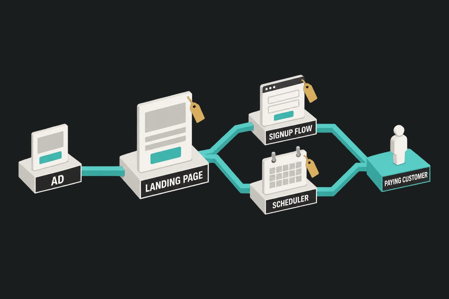
Judge each page on its own goal. Pagedeck counts any event you define as a conversion: a purchase, a form submit, a booked call. UTMs from the ad pass through automatically. See how ad-matched landing pages work.
What’s a good landing page conversion rate?
Unbounce’s 2024 Conversion Benchmark Report analyzed more than 41,000 landing pages, 464 million visitors, and 57 million conversions. The median conversion rate across all industries was 6.6%. Industry medians ranged from 3.8% to 12.3%.
Use that range as a sanity check, not a target. If your purchase page sits at 2% on cold traffic, the benchmark doesn’t tell you it’s broken. Your cost per conversion does.
The number that matters: cost per conversion
Cost per conversion is your CPC divided by your conversion rate, measured as conversions per click. Hold CPC steady and watch what the rate does to it:
| CPC | Conversion rate | Cost per conversion |
|---|---|---|
| $2.00 | 2% | $100 |
| $2.00 | 4% | $50 |
| $2.00 | 8% | $25 |
Doubling the rate halves the cost. But the rate can’t be judged alone: the same 4% costs $1,000 per conversion on a $40 click and $12.50 on a $0.50 click. Whether either is good depends on what a conversion is worth.
Take a hypothetical media buyer named Tomás, running Meta for an outdoor gear brand. His cold-traffic page converted 2.5% of link clicks at $1.20 per link click: $48 per purchase.
His team wanted a rebuild because 2.5% looked weak next to 6.6%. Then he ran the margin: a $120 average order at a 55% gross margin is $66, and after shipping and payment fees each order still covered its $48 media cost. The page was profitable on the first order, so he tested the offer instead. (Illustrative numbers.)
Why landing pages convert: relevance, value, risk, effort
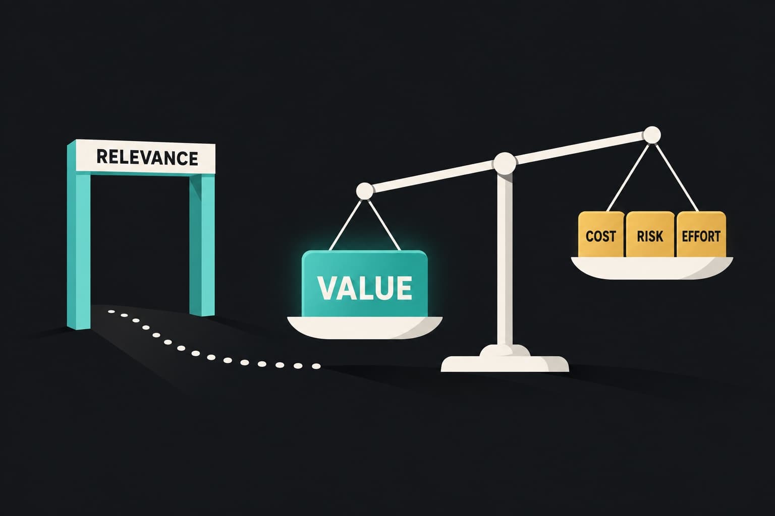
Every conversion comes down to four forces. One is a gate. The other three are a balance.
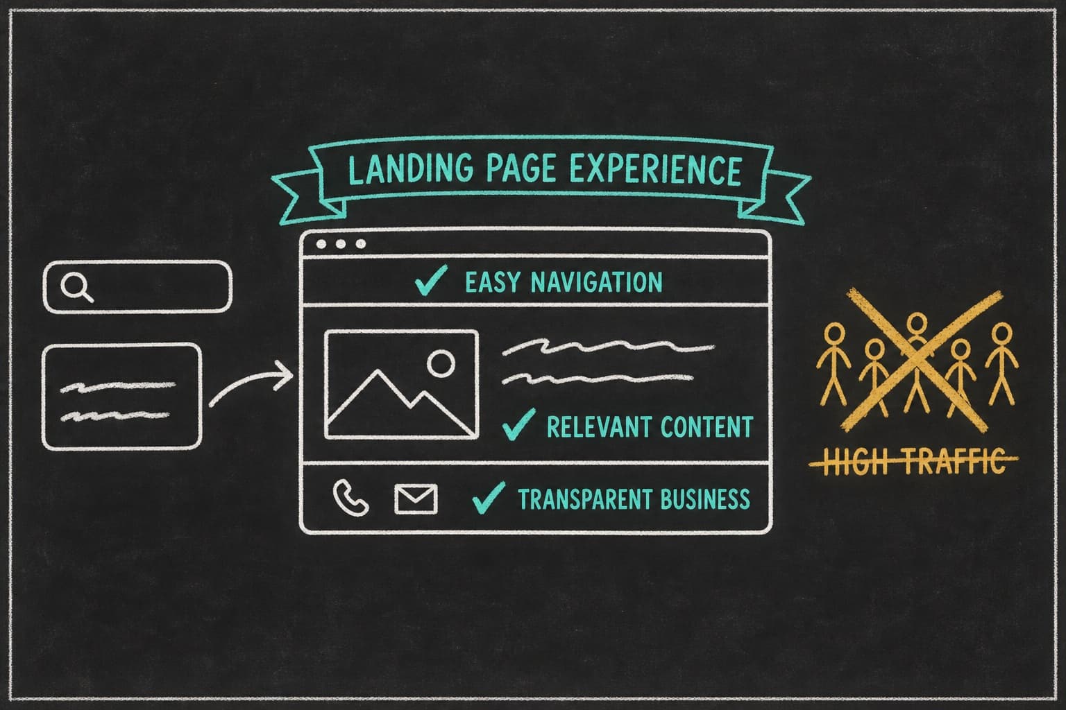
Relevance is the gate: a visitor who clicked a specific promise checks, within seconds, whether they landed on it. If not, nothing else registers. They’re not weighing your offer. They’re leaving.
Value is what the visitor gets: the product, the incentive, and how much they believe it will deliver. The price is the cost it has to beat.
Risk is what could go wrong: wasted money, a bad fit, an unwanted sales call, a subscription they can’t cancel.
Effort is what acting costs besides money: reading, deciding, filling in fields, hunting for answers the page left out.
That’s what makes a good landing page: past the gate, visitors convert when value clearly outweighs cost, risk, and effort combined. Each element below keeps relevance, raises value, lowers risk, or lowers effort. When a page underperforms, the question is which force is losing.
The 7 elements of a high-converting landing page
Most lists of landing page elements stop at the headline and the button. A high-converting landing page gets seven things right:
- Message match with the ad that sent the visitor
- An offer worth more than it costs
- A hero that says what, who, why believe it, and what next
- Proof matched to the objection
- Risk reversal with specific terms
- One goal and one CTA, repeated
- Low friction: cognitive, informational, and mechanical
1. Message match: the gate every other element depends on
Message match works because the click was a question: is this the thing from the ad? The first screen answers it. Match the offer, the angle, the words, and the visual. An ad promising “automate your invoices in a day” should land on invoice automation in a day, not on “the all-in-one finance platform.”
Google defines landing page experience as “how relevant and useful your landing page is to people who click your ad” (Google Ads Help). Visitors run that test on every channel.
The practical problem is volume: twelve ads with twelve angles can’t all match one page. That’s the job Pagedeck was built for. Point it at an ad and it picks up the offer, the angle, and the creative, then builds a landing page that continues the ad’s pitch. Connor Rolain, Head of Growth at HexClad, on the workflow: “Once you find a format that works, you can easily duplicate it and swap out copy/media to make it congruent with your ad creative.”
2. The offer: the biggest lever on the page
The offer is what the visitor is actually deciding on: the product, the price, the incentive, and the terms. It sets both sides of the balance: what they get and what it costs. A mediocre page with a strong offer usually beats a polished page with a weak one, so tuning headlines before the offer is backwards.
- Ecommerce: bundles, tiered discounts, gift with purchase, subscriptions. A meal-kit brand’s “two boxes at 50% off” and “$60 off your first box” are different offers at similar cost. Pagedeck builds these into Shopify pages; run the BOGO and bundle offer math first.
- SaaS: trial length, whether a card is required, and what’s included.
- Services: a free quote, inspection, or consult, plus a response time. “Free inspection within 48 hours” beats “contact us.”
- Lead gen: the incentive. Richer incentives raise capture rate and often lower lead quality; here’s why richer incentives produce worse leads.
3. A hero that answers what, who, why believe it, and what next
The hero is the first screen. Before the visitor scrolls, it has to answer four questions: what is this, is it for me, why believe it, and what do I do next?
A headline in the ad’s words, a subhead naming the audience, one proof element (a rating, a logo row, a result), and a visible CTA answer them in that order.
Weak heroes usually fail on who or why. “Project management, simplified” answers neither. “Project tracking for agencies that bill by the hour, used by 2,000 studios” answers both, if the number is true.
4. Proof matched to the objection
Proof, social or otherwise, works when it answers the doubt the visitor has at that point on the page. A shipping testimonial next to the price does little for someone worried about fit. Map each major objection to the proof that answers it, and put that proof where the objection comes up.
In ecommerce, reviews carry real weight. Northwestern’s Spiegel Research Center, using PowerReviews data, found a product with five reviews had a 270% higher purchase likelihood than one with none: 190% for lower-priced products, 380% for higher-priced ones. Purchase likelihood peaked at 4.0 to 4.7 stars, then fell toward 5.0. A wall of perfect scores can read as filtered.
Outside ecommerce, proof changes shape. B2B buyers look for logos from companies like theirs and a named case with a number. A roofing customer looks for local reviews, a license number, and before-and-after photos.
For US pages, the FTC’s final rule on fake reviews and testimonials took effect in October 2024. It bans fake reviews, reviews bought for positive sentiment, and undisclosed insider reviews, with civil penalties. Proof has to be real.
5. Risk reversal
Risk reversal changes the question from “what if this doesn’t work?” to “I can undo it.” It lowers risk without touching price, one of the cheapest ways to shift the balance.
It only works when it’s specific. “Satisfaction guaranteed” barely registers. “Try it for 60 days. If it’s not for you, we’ll refund you and cover return shipping” is a term the visitor can picture.
In the US, the FTC’s guides on advertising guarantees (16 CFR Part 239) say a satisfaction or money-back guarantee should clearly disclose its material conditions.
- Ecommerce: a return window, who pays return shipping, and how to start a return
- SaaS: no card required for the trial, or cancel anytime from the account page
- Services: a fixed quote before work starts, or a written workmanship warranty
- Lead gen: “no sales call unless you book one”
The terms are the business’s policy. The page’s job is to state them where the doubt shows up, usually next to the CTA.
6. One goal, one CTA, repeated
Every competing goal costs attention, and attention is effort. A newsletter signup, a demo request, a nav bar, and three blog links all pull against the one action you’re paying for.
That isn’t the same as offering fewer options. The evidence that choice itself hurts is weak: a meta-analysis of 50 experiments with 5,036 participants found a mean choice-overload effect of virtually zero (Scheibehenne, Greifeneder, and Todd, 2010). A three-tier pricing selector or a 1, 2, or 3-pack choice is fine. Two different goals competing for the same click is not.
Repeat the same CTA after each major section so nobody scrolls back up to act. Name the outcome, not the mechanics: “Get my free inspection” beats “Submit.” Landing page design best practices, like CTA contrast and mobile layout, handle the execution.
7. Friction: cognitive, informational, mechanical
Most friction advice is about form fields. Fields are the smallest of three kinds.
- Cognitive: the visitor has to work to understand. The page doesn’t match the ad, or the offer takes three reads to parse.
- Informational: a question left open. What does it cost? When does it ship? Can I cancel? What happens after I submit?
- Mechanical: fields, steps, slow loads, tap targets too small for a thumb. In Unbounce’s benchmark data, 83% of landing page visits happened on mobile, so test every page on a phone first.
Remove the first two before you count fields. Some friction is useful on lead gen pages: a qualifying question lowers volume and raises lead quality. For the form itself, embed the one your CRM or email tool already provides; Pagedeck can count its submit as the page’s conversion.
How the elements shift with traffic temperature
What the visitor already knows decides which elements do the heavy lifting.
| Traffic | Who it is | Elements doing the heavy lifting |
|---|---|---|
| Cold | Prospecting, first exposure to the brand | Message match, a hero that answers “who” and “why believe it,” and proof |
| Warm | Retargeted site visitors and social engagers, email subscribers | The offer and risk reversal: they know you, and something stopped them |
| Hot | Branded search, high-intent keywords, cart and form abandoners | Low friction and a clear CTA: get out of the way |
Cold pages run longer because they build belief from zero; hot pages can be short. For full section order, see these section-order blueprints by traffic temperature.
Diagnosing a landing page that isn’t converting
When a page underperforms, the numbers usually point at the losing force. Start with the symptom, not a redesign.
| Symptom in your numbers | Likely failing element | First test |
|---|---|---|
| Most visitors leave within seconds | Message match | Rewrite the headline and hero to continue the ad’s promise |
| Visitors scroll the whole page but few click the CTA | The offer, or proof that misses the objection | Test the offer: bundle, trial terms, incentive, price framing |
| Visitors click the CTA but few complete the purchase, form, or booking | Risk reversal or friction | State price, shipping, and cancellation terms before the click; cut a step |
| Strong conversion rate, but cost per conversion is still too high | Usually not the page: CPC, targeting, or offer economics | Check results by ad; revisit the offer’s margin before touching layout |
Read results by ad, not by page
A blended rate hides the mismatch. Owen, a hypothetical marketer at a roofing company, ran two search ads to one page. One promised “free roof inspection within 48 hours.” The other targeted storm damage and insurance claims. The page, headlined “Trusted roofers since 1998,” converted 5% of clicks into inspection requests.
Split by ad, using a distinct utm_content on each, the inspection ad converted at 8% and the storm ad at 2%. Storm visitors wanted help with an insurance claim, and the page never mentioned one.
Owen built a second page that led with claim help and storm-damage photos. The storm ad climbed to 6%. (Illustrative numbers.)
The structural fix is one page per ad or angle, so page results are ad results.
Ready to split the page by ad? Point Pagedeck at each ad and it builds the matching page, same offer, same story, on-brand. Build your first page free, no credit card needed.
High-converting landing pages across business models
Ecommerce. The offer and the match carry most of the weight. Gravel changed where its paid traffic landed and reported 66% lower cost per conversion on one campaign and 37% lower cost per purchase on another. Here’s how Gravel cut cost per conversion by 66%. Those are Gravel’s purchase results, not a promise for any other business.
SaaS trial. The offer is the trial terms, and the risk is commitment. Hana, a growth lead at a hypothetical project management tool, ran a 14-day trial that required a card. At a $4 CPC, 3% of clicks started a trial and 40% of trials paid: about $333 in media per paying customer.
Her “no card required” variant lifted trial starts to 5.5%, but only 25% paid: about $291 per paying customer. It won narrowly, and she only knew because she judged it on paying customers. (Illustrative numbers.) Pagedeck can count the signup as the page’s conversion, with its tag on your signup flow; trial-to-paid lives in your billing data.
Local services. Relevance and risk dominate: do you serve my area, can you come soon, will the bill surprise me? A free inspection with a response time and a fixed quote answers all three.
B2B webinar. The offer is what the attendee walks away with, not “join our webinar.” Proof is the speaker. The registration is the conversion, which Pagedeck can count as a custom event.
For real pages to study, browse these landing page examples that convert paid traffic.
Building a high-converting landing page is an iteration problem
Why the first version is rarely the winner
The first version of a page is a guess about which objection matters most, which offer framing lands, and which proof answers the doubt. So how to create a high-converting landing page is less about the first draft than the next ten.
Fulton sent 100% of its paid traffic to dedicated pages and ran 50+ iterations on them. Here’s how Fulton increased paid conversion rate by 110%. The iteration count is the point.
What to test first
Test in order of impact:
- The offer: the biggest lever, and often the last one tested
- The headline and message match: especially when results differ sharply by ad
- Proof: which objection it answers and where it sits
- Friction: steps, fields, and the questions the page leaves open
Every Pagedeck page ships with server-side A/B testing, so a test doesn’t flicker on paid traffic. Pagedeck doesn’t calculate significance for you. Decide the sample size with a free calculator like Evan Miller’s before the test starts, and read the full playbook on A/B testing landing pages.
Frequently asked questions
Can you give me an example of a high-converting landing page? Look for a page built for one ad, with a clear offer, proof near the objection, and one CTA. For real pages across categories, see these landing page examples that convert paid traffic.
What’s a good landing page conversion rate? Unbounce’s 2024 benchmark puts the median at 6.6%, with industry medians from 3.8% to 12.3%. The better test for your page is whether cost per conversion sits below what a conversion is worth.
Is a 12% conversion rate good? For a cold-traffic purchase page, 12% would be exceptional. For a free ebook or webinar registration, it’s near the top of Unbounce’s industry medians but well under the 30% bar Unbounce uses for its own high-converting examples. Check cost per conversion and the quality of what converts before celebrating.
What should a good landing page have? What makes a good landing page is the same seven elements. Message match with the ad, an offer worth more than it costs, a clear hero, proof matched to the objection, specific risk reversal, one repeated CTA, and low friction.
What are the most common landing page mistakes? Sending every ad to one page, tuning buttons before the offer, vague guarantees, proof that misses the real doubt, and judging on a blended rate instead of results by ad.
Conclusion
A high-converting landing page isn’t a checklist. It’s a page where the visitor finds the promise from the ad, and the offer’s value beats the cost, risk, and effort of acting.
Judge the page on cost per conversion for its goal, not on someone else’s benchmark. Get the match and the offer right before you touch the button. When results stall, read them by ad, let the symptom point to the failing element, and iterate.
Pagedeck is built by a team that’s generated $100M+ in revenue with custom landing page funnels. Point it at an ad and it builds the page that continues the pitch, with server-side A/B testing on every page.
Build your first page free, no credit card needed, and turn your next ad into a high-converting landing page.